Wednesday 30 November 2016

Photoshoot plan 2


On the 30th November in the afternoon I will capture an image of a slice of lemon as a close-up shot and then edit it to give it a very underground, Indie look. I am doing this because the Stone Roses feature on my contents page and a slice of lemon is a commonly known icon that represents the stone roses so I can link that to the Stone Roses article on my magazine and it makes my contents page look higher profile and more appealing. Obviously no make-up will be needed but I can edit the photo to give it an Indie feel as well as linking it to the Stone Roses. I intend to do this on a messy work surface with paint splatters which is also heavily linked to the Stone Roses so my contents page also have a very heavy Stone Roses presence as well as my cover artist and artist that is also featured on the front cover "Sophie Black". Pictured below are images off of the internet that are similar to my Stone Roses idea.


Monday 28 November 2016

TA Questions

1. How do you consume print media?
2. If you don't buy/download magazines, why not?
3. What would encourage you to buy/download a magazine?
4. What about my magazine attracts you?
5. Does my magazine follow an Indie theme?
6. Do you like my models pose?
7. Do you like the different fonts?
8. What are your first thoughts of my masthead?
9. What would you change about my front cover?
10. Do my cover stories fit in with the theme of my magazine?

Friday 25 November 2016

Front Cover Draft 1


Here is my final front cover designed on Adobe Photoshop Elements 11 for my music magazine "Indiescale". 

Thursday 24 November 2016

New cover star planning post

I will take my cover star Myles Chapman to a rural wooded area to capture some images for my front cover, he will have a very careless facial expression yet showing a slight sense of arrogance as that is my cover stars confident, cocky attitude. He will wear a long cagoule style rain coat as it is now heavily associated with Indie music due to the Stone Roses wearing them around 90% of the time. He will wear black trousers and black shoes as they are very dull colours and it matches his facial expressions in a dull, careless manner. He will have his arms spread out as if he is asking someone for a fight whilst making eye contact with the camera to make it look more direct to the individual looking at the image.

I will then take him to a run down urban area in Brigg picturing him sat in front of a wall of graffiti where I will get images of him looking away from the camera supporting his careless persona but it also shows that it is a rough area and these areas are the low areas he used to be associated with as he started from the bottom.

New Cover star

Due to complications with my last cover star Keaton Fussey my star will now be Myles Chapman, I will keep the same kind of background story line however I am going to change the name of my star and also the kind of clothing for my images as the clothes that suit Keaton do not suit Myles.

Saturday 19 November 2016

Photoshoot plan

I will take my cover star Myles to a bridge in Brigg a long the River Ancholme where I will firstly capture him sat against a wall of graffiti, with photos of him looking away from the camera and making eye contact. I will most likely use this on my contents page as it looks as if he is looking at his details on the page and his clothing will also link to the title creating synergy.
I will then picture him leaning against on of the pillars underneath the bridge with the river in the background as this will be a very powerful, majestic shot. I will again capture images of him looking away from the camera and making eye contact. I will use this for my DPS as he be captured on the right of the image so he can then be stood looking at the text which will be pictured on the left on the water and in the background.
I will capture Myles on a cage with a metal fence in the background so even though its a rural area it gives it an edgy, urban feel. He will be stood in a very confrontative pose as if he is calling someone out for a fight or standing his ground as this matches his persona which will be identified when you read my DPS text. This will be used for my front cover as that is the first thing my TA will see and that will be their first impression of my cover star and I want them to be intimidated and get the impression he is careless and a rebel.
He will be wearing a waterproof parka style rain coat as it is now heavily associated with Indie music due to the Stone Roses wearing them around 90% of the time. He will wear black trousers and black shoes as they are very dull colours and it matches his facial expressions in a dull, careless manner.

Tuesday 15 November 2016

Planning post

This weekend I plan to meet the cover star of my magazine, Keaton Fussey and go to a few different areas to capture some images for my magazine. For my front cover  I intend to take him to a rural, wooded area and get an image of him looking very careless, slightly arrogant and confrontational as it suits the persona I want my cover star to have. He will have messy hair, a denim jacket, denim ripped skinny jeans and Doc Martin boots and his guitar as a prop, I will use a whole body shot for my front cover. For my contents page I intend to take pictures in the same jeans and shoes but to wear a rugged  T shirt, I want this image to be captured in a more urban, grey looking area, that is why I will take him underneath the fly over in Brigg where is all concrete and there is graffiti as this adds a rough look to the image, it makes him look of a lower class and it shows the kind of places he has rose to  fame from.

For my contents page I will also take Sophie Evans to a run down, urban area to capture images for my contents page, she will be wearing smoky make-up, have messy hair. She will wear a black bucket hat, a mustard coloured jumper, jeans and brown boots.  I intend for her to have a very lifeless  facial expression and a very careless pose. Slouchy arms by her side and slightly bent knees. This is to back up her lack of emotion and her constant calm attitude.

Monday 14 November 2016

Research - 3 front covers - TA Profile

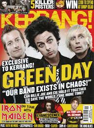
I think this magazine aims so have to an adolescent target audience, first I think this due to the facial expressions of the subjects of the front cover, they have a very guilty yet surprised look on their faces and they are wearing pale make up with black eye shadow, I think if this was aimed for a middle aged TA then they would not be pulling these facial expressions, they would have more of a serious look on their face and they also would probably not be wearing this kind of make up, they would look a lot more normal. The bright colours also give off the impression this front cover is aimed for an younger target audience as commonly middle aged magazine covers tend to be a lot more bland and less eye-catching. The free gift of posters also gives away this magazine is for a younger audience as adults do not tend to collect nor be appealed by posters from a magazine.
This front cover indicates that this magazine aims to attain an older/middle aged target audience as firstly the cover star has a very plain look on his face, he isn't wearing any out of the ordinary make up, he looks like a very normal person, he is just making firm eye contact with the camera. Secondly he also has a very normal and calm stance, he looks very laid back and mature which adults tend to prefer. Also the page isn't clustered, it is very organised and in order and is very simple to understand, the front cover doesn't contain many different colours either, it is made up of red, grey, black and white so it is very plain. The cover star is also wearing blue which is perceived by most people as a calm colour which indicates the subject is a calm person and again, adults tend to prefer a calm personality.


This front cover indicates to me that this magazine is aiming to attain a middle aged target audience. I think this because the colours are very dark, normally on magazines for younger audiences the magazine colours are a lot brighter and they vary a lot more. Secondly the background isn't very busy either, there is some scratched texts which gives off an eerie feel that also indicates that this magazine is for an older audience but normally on magazines for younger audiences they have a more appealing background. The cover star also looks of an older age which means its a possibility he was playing music in an adults generation so he will appeal to them more as they're the target audience rather than a younger star playing in a new generation of music. 

Change name of masthead

I am changing the name of my masthead as it uses the wrong connotations and seems like more of a photography magazine name. I will instead call my magazine Indiescale as Indie obviously suits the genre and scale suits a music scale therefore this links to Indie music a lot more.

Tuesday 1 November 2016

Clothing that could be used for front cover star


         This is some of the clothing that could be used for my cover star, I think all of these items of clothing give of the impression that the cover star is fashionable and this can attract many fans and also influence them to copy him due to his style. I think some of these clothes are very messy and large and this typifies the Indie style, my cover star wearing this style of clothes isn't only adhering to Indie conventions, it's showing he is a very messy, common, rugged person who is the same at heart as anyone on the street, he doesn't think as himself as a famous musician. The Leather items I think would be good simply because they're heavily associated with Rock and subgenres of Rock in general (Indie Rock) this also gives my cover star a rebel look which accompanies the fact he has walked down a long, rough, rocky road to get to the success he has achieved.


DPS Research: Consolidating my research

How this influenced my planning and creativity


DPS 1 has influenced my creativity and planning as I like the fact a picture fills up one whole page and the text is on another whole page, I may choose to use this in my music magazine. On the other hand I do not like the colour scheme used and I do not like the way the title of the article is laid out, therefore I will not use these features for my magazine. I like drop capital and I plan to use this in my magazine as it is a good feature and it also stays in line with the text.

DPS 2 has influenced my planning and creativity as I like the way the image travels across two pages, I also like the way synergy is created between colours on the image and colours in the text and on the page. I have also used Thinglink which has introduced me to new methods of technology related to media.

DPS 3 has influenced my planning and creativity as I like the way the columns are set out neatly into three and how a drop capital is used yet is still neatly aligned in the text. I like how all text is on one page and the image on the other and I like the consultative medium used between interviewer and interviewee, I think it gives a magazine a very laid back, casual feel and I also like how synergy is created between the colour of the logo on the magazine and the colours used on the DPS.


Indie hairstyles for front cover star

Below some hairstyles that reflect the Indie genre, they're very unusual and that is the aim of Indie, to be noticed by being different, I think some of these are messy which could reflect my cover stars rugged, careless persona and of course it is my cover star adhering to a key convention of the Indie genre. Some of these are also bright colours, this clearly stands out again, this adheres to Indie conventions, however this also makes my cover star look different but the point here is that it would make him look different and that he has reached succession in music his own way using his own methods and he is happy to stand out and doesn't care what people think.


Star images in magazines

On this image the star is acting very immature, as a heavy metal vocalist he is breaking many conventions, the perception of a metal artist is a lot of tattoos, fully black, leather clothing and black make-up, the cover artist here could be seen as mocking the metal appearance with his immaturity.  He is also going against Greens theory as he is wearing very feminine clothes and as a male and a metal artist some perceive this as very unusual and the evident fact that a female will most likely look at a man in feminine clothes and see him as masculine and attractive.


On this image the band are completely adhering to Richard Dyer's theory as they look like the stereotypical musician of their genre, their black clothes, black face paint, black, long hair and metal studs and spikes on their clothes all represent rock music, their pose is also clearly adhering to the conventions of a rock artist.


                                    On this image the cover star isn't the stereotype of his genre however he does have some characteristics that would point out he is an acoustic musicians, firstly he his obviously holding an acoustic guitar as a prop, he has very casual clothing which is normally worn by acoustic musicians, even on stage. He also has the messy hair and it is clear his sleeves are rolled up and his arms are up so the reader can see his tattoos.