
Monday 31 October 2016
Research DPS 2
 This has influenced my planning and creativity as I like the way the image travels across two pages, I also like the way synergy is created between colours on the image and colours in the text and on the page. I have also used Thinglink which has introduced me to new methods of technology related to media.
Research DPS 1
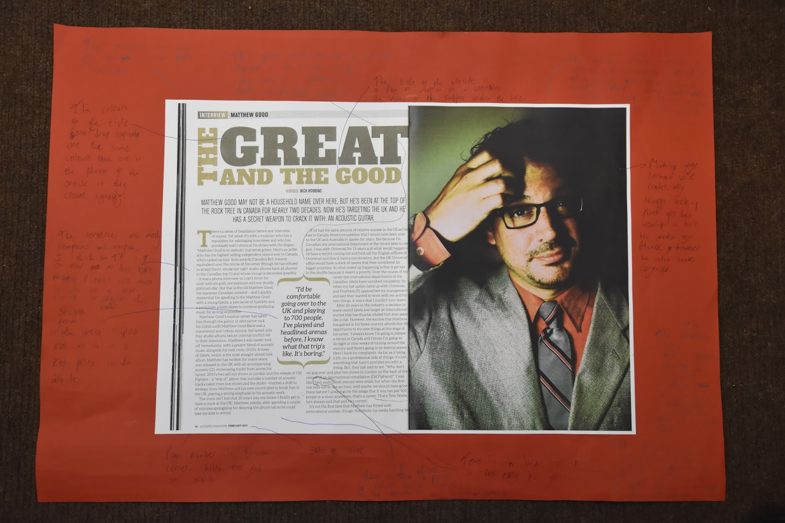
This has influenced my creativity and planning as I like the fact a picture fills up one whole page and the text is on another whole page, I may choose to use this in my music magazine. On the other hand I do not like the colour scheme used and I do not like the way the title of the article is laid out, therefore I will not use these features for my magazine. I like drop capital and I plan to use this in my magazine as it is a good feature and it also stays in line with the text.
Front Cover Research: Consolidating my research
How this research has influenced my Planning and Creativity
Front cover analysis 1 which was for Q magazine influenced my planning and creativity as I have picked out elements of this front cover and it gives me more of an idea of how I may want to layout my front cover and the type of codes and conventions I may want to use to attain a higher grade. I liked the way the colour of the shirt the subject was wearing creates synergy and links with the text that gives references to other articles on the front cover.
Front Cover analysis 2 of Kerrang has given me some new ideas, I really like how the background and colour of the masthead work together as they're both the same kind of colour, I do not like how crowded the page is and has given me the idea not to crowd my front cover for my music magazine.
I also intend to use the style banner on this front cover to advertise a free gift on my front cover.
Front cover 3 influenced my planning and creativity due to the fact the clothes of the subject creates synergy with the background and the colour of some of the text as this seems to be a very black orientated front cover, after seeing this I may want to link the appearance of my cover star to the background and other characteristics of the front cover. I also liked how the text going across the middle of the page linked to the banner and pugs due to them following the same colour scheme. However I didn't like how there was a large piece of text going across the page as I think it takes away from the effect of the pose from the cover star and due to my negative opinion I am obviously not going to use it in my magazine.
Front cover 4 has influenced my planning and research as I like the way there isn't a lot crowding the front cover and I also like how the front cover star's guitar is included in the picture and finally I like how synergy is created from the colour of some of the text linking with the banner on the page. I may choose top use these features in my magazine as I think they're effective.
Contents page research: Consolidating my research
How this has influenced my creativity and planning
Contents page 1 has influenced my planning and creativity as I now have a better idea of how to set out my contents page. I like the fact that many different smaller images have been used on this contents page and also the fact they follow a very similar colour scheme, I think is a very effective and noticeable feature. I have also learned how to use prezi which has introduced me to new technology related to media.
Contents page 2 has influenced my creativity and planning as I like the black and white retro effect used on the image, from the contents pages I've research I have not come across this therefore I may use it as it seems quite unique, I also like all of the contents information is in on single column aligned to the right so there is more room for a large image. I have also used slideshare which is improving my knowledge on technology related to media.
Contents page 3 has influenced my creativity and planning as I like the way the text is wrapped tight around the shape of the images body, I may choose to use this in my magazine as it is very effective aesthetically. I do not like the camera angle used and I will definitely not use this in my magazine and I also think the colour scheme is very boring and it will also not feature in my contents page. I have also used slideshare which is improving my knowledge on technology related to media.
Planning post: Star image
I am going to create a rising star who has quickly broken into the indie music scene and has hit the ground running, they have just released their latest song which has topped the indie music chart, therefore they are the cover story of my magazine as they are a hot prospect. He is a male and he has a very Indie look, he adheres to indie conventions and due to this he is ideal for the indie front cover.
My star is becoming very popular and is being head hunted by many large record companies, he has a very careless attitude and does not care about the criticism people give him for being so young and reckless.
I want to create an image that is stereotypical Indie so people can get a good perception of Indie appearance and an Indie kind of lifestyle. People should instantly be able to tell he is of an Indie genre due to the characteristics I intend to give him.
His prop will be a guitar, whether it is electric or acoustic hasn't been decided yet, I want him have an almost lifeless facial expression, I want him to look like he doesn't care which matches his persona, I also want him to have a pose that makes him look like he doesn't care but also almost as if he is tough and arrogant. I want him to be holding with his guitar showing he is so popular for the reason he is such a good musician, and he wants everyone to know it.
The Indie look is based on messy hair, very dull and lifeless facial expressions, unusual clothing, nothing specific, just clothes that aren't really the common trend, everything here is what I want my star to adhere to. This also supports Richard Dyers theory of representation.
I intend for the location to be in a forest or a wooded area, I think a background including nature makes the front cover a lot more realistic and makes the image come to life, also I would like to break the convention of location of an Indie magazine as Indie front covers usually tend to be studio shots and I want to avoid this.
Contents page research 3
Contents research 3 from RyanFrankish7
This has influenced my creativity and planning as I like the way the text is wrapped tight around the shape of the images body, I may choose to use this in my magazine as it is very effective aesthetically. I do not like the camera angle used and I will definitely not use this in my magazine and I also think the colour scheme is very boring and it will also not feature in my contents page. I have also used slideshare which is improving my knowledge on technology related to media.
This has influenced my creativity and planning as I like the way the text is wrapped tight around the shape of the images body, I may choose to use this in my magazine as it is very effective aesthetically. I do not like the camera angle used and I will definitely not use this in my magazine and I also think the colour scheme is very boring and it will also not feature in my contents page. I have also used slideshare which is improving my knowledge on technology related to media.
Contents page research 2
Contents page research 2 from RyanFrankish7
I like the black and white retro effect used on the image, from the contents pages I've research I have not come across this therefore I may use it as it seems quite unique, I also like all of the contents information is in on single column aligned to the right so there is more room for a large image. I have also used slideshare which is improving my knowledge on technology related to media.
Locations used in existing magazines
There is no genre specific kind of location used for an indie magazine, however, after doing my research it seems that studio shots are often used however, it is rare that scenic backgrounds related heavily to nature are used, or there are also some very rough looking urban backgrounds used, I think these sort of shot is effective as it shows a sense of being quite tough or even a rebel kind of look is given off.
It seems that the convention is to have a studio shot so I intend to break this convention and have an outdoor background which could be either rural or urban, I am not completely sure yet.

In this there is a prop used however it is a studio shot as are many other issues of Under The Radar magazine, they're clearly adhering to the conventions of an Indie magazine, however, I intend to break the convention as I think this is quite boring and does not attract the reader as much as it potentially could.

I like the location used in this image as firstly, it breaks conventions of a music magazine by the cover image not being captured in a studio, I think regardless to it being out of focus (which is an effect I actually quite like) I think the bright colours of nature bring out the cover star and due to my magazine being an Indie magazine it is a genre that is heavily associated with nature so it is adhering to Indie conventions and also can be a very effective shot due to it being a busy background. I would take my cover star to an area that is very busy with nature, preferably a green, wooded area near a river, lake as there is a lot going on of which is all nature orientated in the background so my magazine can adhere to conventions of Indie magazines, it also gives my cover star a whole new depth as people begin to question whether there is a connection to my cover star and the location of the image.

I think this image of NME magazine looks very chilling, I think it is an interesting background and it would certainly break Indie conventions, however, I think it looks too rebellious and dangerous to appeal my TA (fans of the Indie genre) The fans of Indie are mostly very peaceful and are very pleased by nature and the gravel, stones and metal in this image is quite the opposite, it just looks like wasteland which doesn't provide a very busy nor attractive background so I intend not to use something like this for my magazine.
Research contents 1 - Acoustic Magazine Issue 123
This has influenced my planning and creativity as I now have a better idea of how to set out my contents page. I like the fact that many different smaller images have been used on this contents page and also the fact they follow a very similar colour scheme, I think is a very effective and noticeable feature. I have also learned how to use prezi which has introduced me to new technology related to media.
Checking masthead
I have checked if my masthead has already been used for another magazine and it has not, therefore I can use this for my indie music magazine.
Friday 21 October 2016
Research TA-Mastheads
I asked 20 people which masthead from my planning they liked the most and which I should use for my Indie music magazine and if it would adhere to conventions of an indie magazine, the three most popular fonts are listed below as A, B and C, there were two joint 1st votes however I think I will choose A as it relates to my genre more and I also like the 3D effect as well as the style inside the letters. I think the runner up option which got the lesser votes is a potential indie music magazine font however it looks like more of a conventional heavy metal/rock masthead and I think this isn't a convention I want to break.
A.

B.

C.

A.

B.

C.

Planning: Possible Mastheads


I chose to use the word Greyscale as my masthead as I think
it sounds very, sharp, modern and edgy, I research filters to do with Indie
music and a lot of bland black and white/sepia style option came up, so I
associated my masthead with this fact, I also think that stereotypical related
to indie are very out of the ordinary and I think my masthead can relate to
this, I think it is very unique and gives a very stereotypical yet modern
perception of my Indie magazine to the reader.
Most of these fonts have a very rugged feel to them and they
look very related to the genre as they have a very man made look to them which
shows relation to the indie style.
Thursday 20 October 2016
My chosen genre

I have chosen this genre as due to my past experiences of playing with scouting for girls who are a large indie rock band combined with the research I will carry out, I think I will perform well with this genre.
The masthead covers around one sixth of the page and goes across the top of the front cover, this is a convention adhered to by most indie music magazines and therefore I intend to use this in my magazine as I think it a very class original layout. The fact that the subject of the front cover is layered in front of the masthead also adheres to conventions and I also intend to use this feature as I think it looks more original and brings out the importance of the feature story more.
The colours of an indie magazine tend to be blacks and whites as a stereotypical person of an indie style is very out of the ordinary and stands out but for unusual reasons and they do not tend to show much emotion, I think the image on the front cover supports my statement and this will be along the lines of what I will use in my music magazine.
The cover story usually focuses on one group of people, in this case it is the vaccines as they are a up and coming band who are progressing their way to the top of the ladder very quickly. Their name is plastered directly across the centre of the magazine with a picture of them behind it.
Indie magazines also tend to have references to other articles on the front cover but a lot smaller in font and out of the way of the shot of the subjects of the front cover, they mainly include other bands and festivals.
Thursday 13 October 2016
Front Cover Research 4 - Genre specific - Acoustic magazine

 The masthead has also followed the convention of a music magazine in the way that the subject of the front cover is placed in front of the masthead and the masthead travels behind the subject however, due to the housestyle, the part of the masthead that is showing is still easy to recognise meaning it will still be purchased by fans of the magazine without question and this then links to brand identity.
I think the image of the subject is also very effective not withstanding the pose is very simplistic, you can see his guitar and I think this and the name of the magazine create synergy and is a very strong feature when recognised by the customer. The grey background does not seem to create a huge effect however it still works well with the red colour scheme that appears on the issue as the red blatantly contrasts with the pale grey and stands out miraculously. I do not think the outfit of the subject relates to anything else on the front cover and I personally don't think it relates to his genre of music therefore this breaks the convention of Richard Dyer's theory of representation. I also think that the fact the subject of the front cover is making eye contact is effective as it is following another convention of a music magazine and that with the banner having a quote from him underneath his face, this also creates synergy as these two features working together gives off the feel that he is stating this to the customer as an individual, not just as a statement for the magazine.
 I think the banner across the top of the page is also very effective as it is showing reference to another article however the way they have worded the text makes it sound interesting and due to the fact it is about a companies rise to fame it is clearly an interesting article so it is in a red banner so it stands out clearly to be identified by the reader.
This has influenced my planning and research as I like the way there isn't a lot crowding the front cover and I also like how the front cover star's guitar is included in the picture and finally I like how synergy is created from the colour of some of the text linking with the banner on the page. I may choose top use these features in my magazine as I think they're effective.
Wednesday 12 October 2016
Front cover analysis 3 - Classic Rock magazine

The first thing I noticed about this magazine was the masthead as covers around a quarter of the page, is in a serif font and is bold and clear to see, this is adhering to a convention of a music magazine, also another convention being adhered to is that the subject of the front cover is placed in front of the masthead because even though the whole masthead cannot be seen, the characteristics of the masthead I have just noted are the housestyle for this magazine and this is recognised by the audience and the product is still purchased because they can identify the magazine easily.
The subject of the front cover's apparel is also quite related to his genre of music as he is wearing all black, this supports Richard Dyer's theory of representation. He is also in a very sinister pose which again relates to his genre of music, he looks like he is summoning something of dark power and this is how the magazine want the subject to be perceived by the audience. The subject is also stood in the centre of the page which is adhering to yet another convention of music magazine. The apparel of the subject also shows large relation to the background which is also very dark and eerie related to his genre.
There is also a clear colour scheme going on as the feature story is in large letters in gold going across the subject, however all of the other references to the other cover articles are adhering to the colour scheme on this front cover as they are also in a bold, gold font. The banner going across the top of the magazine is also following the colour scheme as that is also gold with black writing, they have switched this around so it stands out when the reader looks at the front cover as this is also an important article.
In the top corner along the banner is also a puff showing a reference to a free gift, this breaks the colour scheme and this is so it can be clearly seen by the customer, this is almost a method of persuasion so the magazine will be bought if there is a free gift inside. Also the pugs are in the bottom corner of the magazine and this adheres to the convention of a music magazine.
This has influenced my planning and creativity due to the fact the clothes of the subject creates synergy with the background and the colour of some of the text as this seems to be a very black orientated front cover, after seeing this I may want to link the appearance of my cover star to the background and other characteristics of the front cover. I also liked how the text going across the middle of the page linked to the banner and pugs due to them following the same colour scheme. I didn't like how there was a large piece of text going across the page as I think it takes away from the effect of the pose from the cover star and due to my negative opinion I am obviously not going to use it in my magazine.
Friday 7 October 2016

Thursday 6 October 2016
Research - Front Cover research 2 KERRANG magazine
 On this magazine, the first thing I noticed was the image that cover the whole page, it is very commanding due to the low angle shot making it look like the subject is superior, is in charge and looks threatening. He is also wearing very rugged clothes, making him look like a rebel, this relates to his genre. However he is breaking the convention of the appearance of a heavy metal star, he is not wearing dark make up, he does not have a lot of piercing and he isn't covered in tattoos, therefore this goes against Richard Dyers theory and breaks the convention of representation. I also think this image has been chosen as the cover photo as it shows who is the lead singer and arguably the most recognisable member of the band as you can the drummer in the background however he is very small, pushed to the back and is underneath the lead singer who is a lot bigger signifying that theoretically he is more important and is looking down at the other members of the band. The background colours of oranges and yellows shows relation to the masthead as due to the fire background the masthead is yellow so it is adhering to the theme of the front cover. The subject is also in front of the masthead and is this is adhering to a convention of a music magazine, I think it also gives the perception that he is coming out at you and is dominant and this can also be related to his pose on the front cover. I think this background is also intriguing because the audience do not precisely know why this a fire/explosion background and he is stood like he is in charge in the foreground.
  The masthead is in a san serif font, is positioned across the top of the magazine and covers around a fifth of the front cover, the font and position of this masthead is the magazines housestyle however
 different colours for the masthead are used. It adheres to the convention of a music magazine in the way that the masthead is placed behind the subject of the main article. The masthead is also in a a style of font that makes it looked cracked and this gives it a more gritty, rock and roll look which is connoting the style of music of which the magazine is based on, this also becomes the housestyle which even if putting the subject of the main article over some of the masthead, it makes the magazine still recognisable to the customer and this is where brand identity comes into reference, it is recognised immediately as kerrang due to the font, position and style of the masthead.
This has influenced my planning and creativity as I have picked out elements of this front cover and it gives me more of an idea of how I may want to layout my front cover and the type of codes and conventions I may want to use to attain a higher grade. I really like how the background and colour of the masthead work together as they're both the same kind of colour, I do not like how crowded the page is and has given me the idea not to crowd my front cover for my music magazine. I also intend to use the style banner on this front cover to advertise a free gift on my front cover.
Subscribe to:
Posts (Atom)