Friday 30 December 2016

Institution research

Prometheus Global Media is a New York City-based B2B media company. The company was formed in December 2009, when Nielsen Company sold its entertainment and media division to a private equity-backed group led by Pluribus Capital Management and Guggenheim Partners. Guggenheim acquired Pluribus's stake in the company in January 2013, giving it full ownership under the division of Guggenheim Digital Media. Guggenheim Partners is headquartered in New York and Chicago and serves clients from more than 25 offices in 9 countries. Both Pluribus and Guggenheim have strong and demonstrated track records of successfully managing investments in a variety of companies. 
Prometheus Global media own a few popular brands, Billboard magazine for one is a news website and weekly magazine that cover music, video and home entertainment. Most of the articles are written by staff
writers, while some are written by industry experts. It covers news, gossip, opinion, and music reviews, but its "most enduring and influential creation" is the Billboard charts. This attains a young TA mainly due to the  musicians featured and due to the young TA my magazine would do well on the market with Prometheus.
The charts track music sales, radio airtime and other data about the most popular songs and albums. The Billboard Hot 100 chart of the top-selling songs was introduced in 1955.
Billboard is considered one of the most reputable sources of music industry news. It has a print circulation of 17,000 and an online readership of 1.2 million unique monthly views. The website includes the Billboard Charts, news separated by music genre, videos, and a separate website.

Friday 9 December 2016

DPS Draft 2


Music Magazine Hand Drawn Drafts


TA Research Flickr photos


The feedback on this tells me it is a good photo but it can be improved, I may use this in my magazine

The feedback on this image is very positive, I will use this as the main image for my DPS.

The feedback on this photo is not very positive and I am not a huge fan of the photo, therefore I will not use this in my magazine.

The feedback on this photo seems mixed, I intend to use it as I think it is unusual.

The feedback on this image is very negative and therefore I won't use it for my DPS.

The feedback on this image is good however, I already have one similar I intend to use, therefore I will not use this.

The feedback on this image is good as it gives the reader something to think deeper about, I will use this for my contents page.

Contents Page Draft 4


DPS text

                                                                      DPS TEXT


In this cut-throat world of music, so many shining stars are inflated so much as the next big thing yet they quickly die out and they do not fulfil expectations. However, this young bright spark called Myles is like something the Indie musical revolution has never seen before. He has a new edge and it is taking his quickly growing audience by storm, his new album “Pieces”, it s the highest downloaded on the Indie charts for the fourth week in a row and it isn’t looking like his popularity is about to come to a halt as he has been added to the bill of V festival 2017 and Belgium’s biggest annual music festival Rock Werchter in 2017 also, so it’s fair to say he is going to be a busy man for the foreseeable future.

His music is becoming so popular because he has an edge to his music that nobody else has, he has put his own little spin on the Indie genre and people seem to love it, he is getting noticed by people all over the globe as well as the national success most have probably heard about by now, he is very talented and we can all agree it looks like it is only going to get better as he claims he will be starting to record a second album after his upcoming gigs to promote the new album. We can now see Myles clearly doesn’t have time to waste but he took some time out for Indiescale Magazine to answer a few questions I had to ask the superstar.

Myles firstly I have to ask, what has it been like these past few weeks now you’ve got the album released and you’ve just had a few weeks of fame to deal with before you’re busy again?

It’s been alright to be honest, it hasn’t really hit me hard yet. The whole famous thing doesn’t really bother me. Don’t get me wrong, I’m thankful for it but I’ve worked hard and I just intend to work harder and show the world I’m one of the best musicians in the world. I mean I’m not being funny when I say that the new album is something special and it’s a gift to the fans who have helped get me there.

Who has influenced your music?

Well you know, the greats, I only settle for the best, mate. Stone Roses, some Ian Brown solo stuff, Peace, Arctic Monkeys, The Kooks and Oasis, but the thing is, I like the rappers I do and that’s where this brings Indie to life. It’s boring if you don’t experiment and it can go really good or really bad and quite frankly I don’t care either way. I know how good I am and so should other people after they’ve heard this new album. I’m not going to stop raising the bar by experimenting, ya know what I mean.

Has it been difficult to get where you are today?

Well honestly, yeah and I’ll tell you why, mate, because you can’t trust no one apart from those you know have got your back. The reason I’ve got famous so quickly compared to other musicians is because so many people try to use you and drop you, but that doesn’t rub off on me, I’m not daft. Some people pick you up to let you down in this business and the only thing I can say advice wise on how to succeed is keep your friends close and your enemies closer. At the end of the day it’s a dog-eat-dog world.

What’s your message to all those willing to let others down to benefit themselves?

Stay outta my way.

How did it all start out for you?

Well it was plain luck followed by a good bit of singing but I’ll get to that in a minute. Since I was a kid I knew I wanted to be a musician so I started singing, started hanging around with all the other musicians at school and started getting into bands and that. So, me and my musician mates were at a bar called Reggie’s because this lad we hung around with, James, had a gig so we all wanted to go down there and support him. The thing is though the idiot goes and has one too many drinks and passes out. So, I told his band I’d step in and do the gig with them if I got James’ cut because everyone needs the money when you live in the city. They couldn’t afford to miss the gig and I just saw the opportunity to earn an extra couple of quid on a night out. But anyway, I did the gig and they couldn’t get enough of me, so I started putting my name forward for all these “Battle of the bands” events. You don’t normally get a reply if I’m honest, but the first one that did I jumped on the opportunity and asked James’ band if they wouldn’t mind backing me up since they owed me a favour. We won that, split the money and just went back to our daily routine. I was in bed on the night and the phone woke me up and I tell you what, I was so annoyed someone had woke me up I nearly didn’t answer it! Now I’m quite happy I did to be honest. It was a music promoter called Mike who was at the Reggie’s gig and he asked me to come down to a music studio, meet some session musicians and record a few tracks. So I did. Turns out Mike’s got a few contacts and before you know it, one of my songs from this studio session is on the radio and it all just got bigger really, you pretty much know the rest.

Well there you have it, Myles has a good story to tell and I’m sure that won’t be the last we hear from him. You can also find Myles' new album "Pieces" on iTunes here:   https://itunes.apple.com/gb/artist/mileschapman

Thursday 1 December 2016

Research: TA Profile


Ryan Frankish's Slidely by Slidely Slideshow

Applying Blumler and Katz:

Diversion
This meets the target audiences desire to escape the stress and part of negativity of everyday life. I need to add information, gossip and interviews in my magazine that can entertain, excite and entice the reader to help escape from their problems.

Personal Relationships
The article in my DPS will allow the reader to develop a personal relationship with my artist as it tells the tale of how journey to success began and how different his life is now he is hot property in the music business.

Personal Identity
In the interview in my magazine my artist uses slang and talks about how he used his down to earth persona to succeed in the music business, the words he uses can rub off on others as they want to be like him and to follow some of the footsteps he took when on his path to fame.

Applying Denis Mcquail:

Information
My article will attract people who are interested in other peoples life stories, no matter who they are. It will also appeal to people seeking advice, people who are interested in my artists music obviously and also to people like a down to Earth person as he is being deemed a bad boy in music.

Education
My TA will learn a lot about how to succeed in music and his theory of how to succeed in life in general, of which both include using basic morals and to sometimes it can be a dog-eat-dog world.

Entertainment
My magazine will entertain my TA as it contains competitions, interviews, gig reviews, gossip and some stories that show the reality of the world we live in.


Wednesday 30 November 2016

Photoshoot plan 2


On the 30th November in the afternoon I will capture an image of a slice of lemon as a close-up shot and then edit it to give it a very underground, Indie look. I am doing this because the Stone Roses feature on my contents page and a slice of lemon is a commonly known icon that represents the stone roses so I can link that to the Stone Roses article on my magazine and it makes my contents page look higher profile and more appealing. Obviously no make-up will be needed but I can edit the photo to give it an Indie feel as well as linking it to the Stone Roses. I intend to do this on a messy work surface with paint splatters which is also heavily linked to the Stone Roses so my contents page also have a very heavy Stone Roses presence as well as my cover artist and artist that is also featured on the front cover "Sophie Black". Pictured below are images off of the internet that are similar to my Stone Roses idea.


Monday 28 November 2016

TA Questions

1. How do you consume print media?
2. If you don't buy/download magazines, why not?
3. What would encourage you to buy/download a magazine?
4. What about my magazine attracts you?
5. Does my magazine follow an Indie theme?
6. Do you like my models pose?
7. Do you like the different fonts?
8. What are your first thoughts of my masthead?
9. What would you change about my front cover?
10. Do my cover stories fit in with the theme of my magazine?

Friday 25 November 2016

Front Cover Draft 1


Here is my final front cover designed on Adobe Photoshop Elements 11 for my music magazine "Indiescale". 

Thursday 24 November 2016

New cover star planning post

I will take my cover star Myles Chapman to a rural wooded area to capture some images for my front cover, he will have a very careless facial expression yet showing a slight sense of arrogance as that is my cover stars confident, cocky attitude. He will wear a long cagoule style rain coat as it is now heavily associated with Indie music due to the Stone Roses wearing them around 90% of the time. He will wear black trousers and black shoes as they are very dull colours and it matches his facial expressions in a dull, careless manner. He will have his arms spread out as if he is asking someone for a fight whilst making eye contact with the camera to make it look more direct to the individual looking at the image.

I will then take him to a run down urban area in Brigg picturing him sat in front of a wall of graffiti where I will get images of him looking away from the camera supporting his careless persona but it also shows that it is a rough area and these areas are the low areas he used to be associated with as he started from the bottom.

New Cover star

Due to complications with my last cover star Keaton Fussey my star will now be Myles Chapman, I will keep the same kind of background story line however I am going to change the name of my star and also the kind of clothing for my images as the clothes that suit Keaton do not suit Myles.

Saturday 19 November 2016

Photoshoot plan

I will take my cover star Myles to a bridge in Brigg a long the River Ancholme where I will firstly capture him sat against a wall of graffiti, with photos of him looking away from the camera and making eye contact. I will most likely use this on my contents page as it looks as if he is looking at his details on the page and his clothing will also link to the title creating synergy.
I will then picture him leaning against on of the pillars underneath the bridge with the river in the background as this will be a very powerful, majestic shot. I will again capture images of him looking away from the camera and making eye contact. I will use this for my DPS as he be captured on the right of the image so he can then be stood looking at the text which will be pictured on the left on the water and in the background.
I will capture Myles on a cage with a metal fence in the background so even though its a rural area it gives it an edgy, urban feel. He will be stood in a very confrontative pose as if he is calling someone out for a fight or standing his ground as this matches his persona which will be identified when you read my DPS text. This will be used for my front cover as that is the first thing my TA will see and that will be their first impression of my cover star and I want them to be intimidated and get the impression he is careless and a rebel.
He will be wearing a waterproof parka style rain coat as it is now heavily associated with Indie music due to the Stone Roses wearing them around 90% of the time. He will wear black trousers and black shoes as they are very dull colours and it matches his facial expressions in a dull, careless manner.

Tuesday 15 November 2016

Planning post

This weekend I plan to meet the cover star of my magazine, Keaton Fussey and go to a few different areas to capture some images for my magazine. For my front cover  I intend to take him to a rural, wooded area and get an image of him looking very careless, slightly arrogant and confrontational as it suits the persona I want my cover star to have. He will have messy hair, a denim jacket, denim ripped skinny jeans and Doc Martin boots and his guitar as a prop, I will use a whole body shot for my front cover. For my contents page I intend to take pictures in the same jeans and shoes but to wear a rugged  T shirt, I want this image to be captured in a more urban, grey looking area, that is why I will take him underneath the fly over in Brigg where is all concrete and there is graffiti as this adds a rough look to the image, it makes him look of a lower class and it shows the kind of places he has rose to  fame from.

For my contents page I will also take Sophie Evans to a run down, urban area to capture images for my contents page, she will be wearing smoky make-up, have messy hair. She will wear a black bucket hat, a mustard coloured jumper, jeans and brown boots.  I intend for her to have a very lifeless  facial expression and a very careless pose. Slouchy arms by her side and slightly bent knees. This is to back up her lack of emotion and her constant calm attitude.

Monday 14 November 2016

Research - 3 front covers - TA Profile

I think this magazine aims so have to an adolescent target audience, first I think this due to the facial expressions of the subjects of the front cover, they have a very guilty yet surprised look on their faces and they are wearing pale make up with black eye shadow, I think if this was aimed for a middle aged TA then they would not be pulling these facial expressions, they would have more of a serious look on their face and they also would probably not be wearing this kind of make up, they would look a lot more normal. The bright colours also give off the impression this front cover is aimed for an younger target audience as commonly middle aged magazine covers tend to be a lot more bland and less eye-catching. The free gift of posters also gives away this magazine is for a younger audience as adults do not tend to collect nor be appealed by posters from a magazine.
This front cover indicates that this magazine aims to attain an older/middle aged target audience as firstly the cover star has a very plain look on his face, he isn't wearing any out of the ordinary make up, he looks like a very normal person, he is just making firm eye contact with the camera. Secondly he also has a very normal and calm stance, he looks very laid back and mature which adults tend to prefer. Also the page isn't clustered, it is very organised and in order and is very simple to understand, the front cover doesn't contain many different colours either, it is made up of red, grey, black and white so it is very plain. The cover star is also wearing blue which is perceived by most people as a calm colour which indicates the subject is a calm person and again, adults tend to prefer a calm personality.


This front cover indicates to me that this magazine is aiming to attain a middle aged target audience. I think this because the colours are very dark, normally on magazines for younger audiences the magazine colours are a lot brighter and they vary a lot more. Secondly the background isn't very busy either, there is some scratched texts which gives off an eerie feel that also indicates that this magazine is for an older audience but normally on magazines for younger audiences they have a more appealing background. The cover star also looks of an older age which means its a possibility he was playing music in an adults generation so he will appeal to them more as they're the target audience rather than a younger star playing in a new generation of music. 

Change name of masthead

I am changing the name of my masthead as it uses the wrong connotations and seems like more of a photography magazine name. I will instead call my magazine Indiescale as Indie obviously suits the genre and scale suits a music scale therefore this links to Indie music a lot more.

Tuesday 1 November 2016

Clothing that could be used for front cover star


         This is some of the clothing that could be used for my cover star, I think all of these items of clothing give of the impression that the cover star is fashionable and this can attract many fans and also influence them to copy him due to his style. I think some of these clothes are very messy and large and this typifies the Indie style, my cover star wearing this style of clothes isn't only adhering to Indie conventions, it's showing he is a very messy, common, rugged person who is the same at heart as anyone on the street, he doesn't think as himself as a famous musician. The Leather items I think would be good simply because they're heavily associated with Rock and subgenres of Rock in general (Indie Rock) this also gives my cover star a rebel look which accompanies the fact he has walked down a long, rough, rocky road to get to the success he has achieved.


DPS Research: Consolidating my research

How this influenced my planning and creativity


DPS 1 has influenced my creativity and planning as I like the fact a picture fills up one whole page and the text is on another whole page, I may choose to use this in my music magazine. On the other hand I do not like the colour scheme used and I do not like the way the title of the article is laid out, therefore I will not use these features for my magazine. I like drop capital and I plan to use this in my magazine as it is a good feature and it also stays in line with the text.

DPS 2 has influenced my planning and creativity as I like the way the image travels across two pages, I also like the way synergy is created between colours on the image and colours in the text and on the page. I have also used Thinglink which has introduced me to new methods of technology related to media.

DPS 3 has influenced my planning and creativity as I like the way the columns are set out neatly into three and how a drop capital is used yet is still neatly aligned in the text. I like how all text is on one page and the image on the other and I like the consultative medium used between interviewer and interviewee, I think it gives a magazine a very laid back, casual feel and I also like how synergy is created between the colour of the logo on the magazine and the colours used on the DPS.


Indie hairstyles for front cover star

Below some hairstyles that reflect the Indie genre, they're very unusual and that is the aim of Indie, to be noticed by being different, I think some of these are messy which could reflect my cover stars rugged, careless persona and of course it is my cover star adhering to a key convention of the Indie genre. Some of these are also bright colours, this clearly stands out again, this adheres to Indie conventions, however this also makes my cover star look different but the point here is that it would make him look different and that he has reached succession in music his own way using his own methods and he is happy to stand out and doesn't care what people think.


Star images in magazines

On this image the star is acting very immature, as a heavy metal vocalist he is breaking many conventions, the perception of a metal artist is a lot of tattoos, fully black, leather clothing and black make-up, the cover artist here could be seen as mocking the metal appearance with his immaturity.  He is also going against Greens theory as he is wearing very feminine clothes and as a male and a metal artist some perceive this as very unusual and the evident fact that a female will most likely look at a man in feminine clothes and see him as masculine and attractive.


On this image the band are completely adhering to Richard Dyer's theory as they look like the stereotypical musician of their genre, their black clothes, black face paint, black, long hair and metal studs and spikes on their clothes all represent rock music, their pose is also clearly adhering to the conventions of a rock artist.


                                    On this image the cover star isn't the stereotype of his genre however he does have some characteristics that would point out he is an acoustic musicians, firstly he his obviously holding an acoustic guitar as a prop, he has very casual clothing which is normally worn by acoustic musicians, even on stage. He also has the messy hair and it is clear his sleeves are rolled up and his arms are up so the reader can see his tattoos.                                              

Monday 31 October 2016

Research DPS 3

Research DPS 2

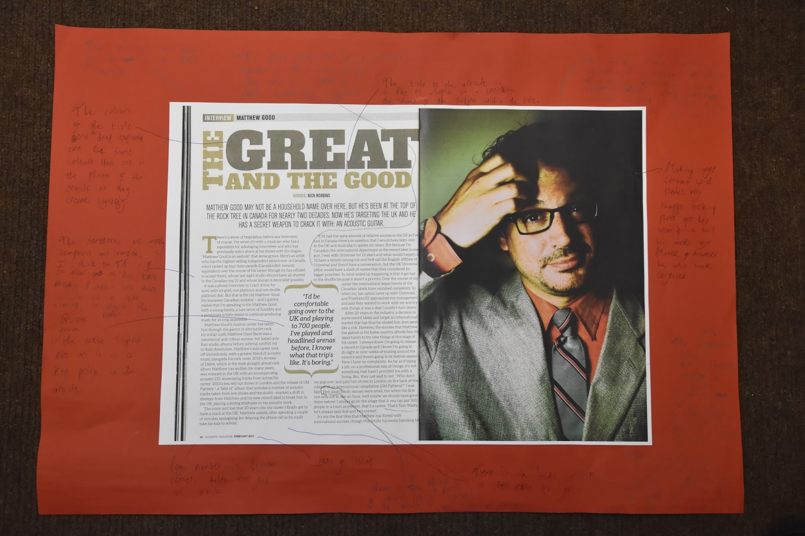
This has influenced my planning and creativity as I like the way the image travels across two pages, I also like the way synergy is created between colours on the image and colours in the text and on the page. I have also used Thinglink which has introduced me to new methods of technology related to media.


Research DPS 1


This has influenced my creativity and planning as I like the fact a picture fills up one whole page and the text is on another whole page, I may choose to use this in my music magazine. On the other hand I do not like the colour scheme used and I do not like the way the title of the article is laid out, therefore I will not use these features for my magazine. I like drop capital and I plan to use this in my magazine as it is a good feature and it also stays in line with the text.

Front Cover Research: Consolidating my research

How this research has influenced my Planning and Creativity


Front cover analysis 1 which was for Q magazine influenced my planning and creativity as I have picked out elements of this front cover and it gives me more of an idea of how I may want to layout my front cover and the type of codes and conventions I may want to use to attain a higher grade. I liked the way the colour of the shirt the subject was wearing creates synergy and links with the text that gives references to other articles on the front cover. 

Front Cover analysis 2 of Kerrang has given me some new ideas, I really like how the background and colour of the masthead work together as they're both the same kind of colour, I do not like how crowded the page is and has given me the idea not to crowd my front cover for my music magazine. 
I also intend to use the style banner on this front cover to advertise a free gift on my front cover.

Front cover 3 influenced my planning and creativity due to the fact the clothes of the subject creates synergy with the background and the colour of some of the text as this seems to be a very black orientated front cover, after seeing this I may want to link the appearance of my cover star to the background and other characteristics of the front cover. I also liked how the text going across the middle of the page linked to the banner and pugs due to them following the same colour scheme. However I didn't like how there was a large piece of text going across the page as I think it takes away from the effect of the pose from the cover star and due to my negative opinion I am obviously not going to use it in my magazine.

Front cover 4 has influenced my planning and research as I like the way there isn't a lot crowding the front cover and I also like how the front cover star's guitar is included in the picture and finally I like how synergy is created from the colour of some of the text linking with the banner on the page. I may choose top use these features in my magazine as I think they're effective.


Contents page research: Consolidating my research

How this has influenced my creativity and planning


Contents page 1 has influenced my planning and creativity as I now have a better idea of how to set out my contents page. I like the fact that many different smaller images have been used on this contents page and also the fact they follow a very similar colour scheme, I think is a very effective and noticeable feature. I have also learned how to use prezi which has introduced me to new technology related to media.

Contents page 2 has influenced my creativity and planning as I like the black and white retro effect used on the image, from the contents pages I've research I have not come across this therefore I may use it as it seems quite unique, I also like all of the contents information is in on single column aligned to the right so there is more room for a large image. I have also used slideshare which is improving my knowledge on technology related to media.

Contents page 3 has influenced my creativity and planning as I like the way the text is wrapped tight around the shape of the images body, I may choose to use this in my magazine as it is very effective aesthetically. I do not like the camera angle used and I will definitely not use this in my magazine and I also think the colour scheme is very boring and it will also not feature in my contents page. I have also used slideshare which is improving my knowledge on technology related to media.

Planning post: Star image

I am going to create a rising star who has quickly broken into the indie music scene and has hit the ground running, they have just released their latest song which has topped the indie music chart, therefore they are the cover story of my magazine as they are a hot prospect. He is a male and he has a very Indie look, he adheres to indie conventions and due to this he is ideal for the indie front cover.

My star is becoming very popular and is being head hunted by many large record companies, he has a very careless attitude and does not care about the criticism people give him for being so young and reckless.

I want to create an image that is stereotypical Indie so people can get a good perception of Indie appearance and an Indie kind of lifestyle. People should instantly be able to tell he is of an Indie genre due to the characteristics I intend to give him.

His prop will be a guitar, whether it is electric or acoustic hasn't been decided yet, I want him have an almost lifeless facial expression, I want him to look like he doesn't care which matches his persona, I also want him to have a pose that makes him look like he doesn't care but also almost as if he is tough and arrogant. I want him to be holding with his guitar showing he is so popular for the reason he is such a good musician, and he wants everyone to know it.

The Indie look is based on messy hair, very dull and lifeless facial expressions, unusual clothing, nothing specific, just clothes that aren't really the common trend, everything here is what I want my star to adhere to. This also supports Richard Dyers theory of representation.

I intend for the location to be in a forest or a wooded area, I think a background including nature makes the front cover a lot more realistic and makes the image come to life, also I would like to break the convention of location of an Indie magazine as Indie front covers usually tend to be studio shots and I want to avoid this.

Contents page research 3


Contents research 3 from RyanFrankish7

This has influenced my creativity and planning as I like the way the text is wrapped tight around the shape of the images body, I may choose to use this in my magazine as it is very effective aesthetically. I do not like the camera angle used and I will definitely not use this in my magazine and I also think the colour scheme is very boring and it will also not feature in my contents page. I have also used slideshare which is improving my knowledge on technology related to media. 

Contents page research 2


Contents page research 2   from RyanFrankish7
I like the black and white retro effect used on the image, from the contents pages I've research I have not come across this therefore I may use it as it seems quite unique, I also like all of the contents information is in on single column aligned to the right so there is more room for a large image. I have also used slideshare which is improving my knowledge on technology related to media. 

Locations used in existing magazines

There is no genre specific kind of location used for an indie magazine, however, after doing my research it seems that studio shots are often used however, it is rare that scenic backgrounds related heavily to nature are used, or there are also some very rough looking urban backgrounds used, I think these sort of shot is effective as it shows a sense of being quite tough or even a rebel kind of look is given off.

It seems that the convention is to have a studio shot so I intend to break this convention and have an outdoor background which could be either rural or urban, I am not completely sure yet.


In this there is a prop used however it is a studio shot as are many other issues of Under The Radar magazine, they're clearly adhering to the conventions of an Indie magazine, however, I intend to break the convention as I think this is quite boring and does not attract the reader as much as it potentially could.


I like the location used in this image as firstly, it breaks conventions of a music magazine by the cover image not being captured in a studio, I think regardless to it being out of focus (which is an effect I actually quite like) I think the bright colours of nature bring out the cover star and due to my magazine being an Indie magazine it is a genre that is heavily associated with nature so it is adhering to Indie conventions and also can be a very effective shot due to it being a busy background. I would take my cover star to an area that is very busy with nature, preferably a green, wooded area near a river, lake as there is a lot going on of which is all nature orientated in the background so my magazine can adhere to conventions of Indie magazines, it also gives my cover star a whole new depth as people begin to question whether there is a connection to my cover star and the location of the image.


I think this image of NME magazine looks very chilling, I think it is an interesting background and it would certainly break Indie conventions, however, I think it looks too rebellious and dangerous to appeal my TA (fans of the Indie genre) The fans of Indie are mostly very peaceful and are very pleased by nature and the gravel, stones and metal in this image is quite the opposite, it just looks like wasteland which doesn't provide a very busy nor attractive background so I intend not to use something like this for my magazine.

Research contents 1 - Acoustic Magazine Issue 123

This has influenced my planning and creativity as I now have a better idea of how to set out my contents page. I like the fact that many different smaller images have been used on this contents page and also the fact they follow a very similar colour scheme, I think is a very effective and noticeable feature. I have also learned how to use prezi which has introduced me to new technology related to media.

Checking masthead

I have checked if my masthead has already been used for another magazine and it has not, therefore I can use this for my indie music magazine.

Friday 21 October 2016

Research TA-Mastheads

I asked 20 people which masthead from my planning they liked the most and which I should use for my Indie music magazine and if it would adhere to conventions of an indie magazine, the three most popular fonts are listed below as A, B and C, there were two joint 1st votes however I think I will choose A as it relates to my genre more and I also like the 3D effect as well as the style inside the letters. I think the runner up option which got the lesser votes is a potential indie music magazine font however it looks like more of a conventional heavy metal/rock masthead and I think this isn't a convention I want to break.

A.


B.


C.

Planning: Possible Mastheads


I chose to use the word Greyscale as my masthead as I think it sounds very, sharp, modern and edgy, I research filters to do with Indie music and a lot of bland black and white/sepia style option came up, so I associated my masthead with this fact, I also think that stereotypical related to indie are very out of the ordinary and I think my masthead can relate to this, I think it is very unique and gives a very stereotypical yet modern perception of my Indie magazine to the reader.

Most of these fonts have a very rugged feel to them and they look very related to the genre as they have a very man made look to them which shows relation to the indie style.