Tuesday, 1 November 2016

Indie hairstyles for front cover star

Below some hairstyles that reflect the Indie genre, they're very unusual and that is the aim of Indie, to be noticed by being different, I think some of these are messy which could reflect my cover stars rugged, careless persona and of course it is my cover star adhering to a key convention of the Indie genre. Some of these are also bright colours, this clearly stands out again, this adheres to Indie conventions, however this also makes my cover star look different but the point here is that it would make him look different and that he has reached succession in music his own way using his own methods and he is happy to stand out and doesn't care what people think.


Star images in magazines

On this image the star is acting very immature, as a heavy metal vocalist he is breaking many conventions, the perception of a metal artist is a lot of tattoos, fully black, leather clothing and black make-up, the cover artist here could be seen as mocking the metal appearance with his immaturity.  He is also going against Greens theory as he is wearing very feminine clothes and as a male and a metal artist some perceive this as very unusual and the evident fact that a female will most likely look at a man in feminine clothes and see him as masculine and attractive.


On this image the band are completely adhering to Richard Dyer's theory as they look like the stereotypical musician of their genre, their black clothes, black face paint, black, long hair and metal studs and spikes on their clothes all represent rock music, their pose is also clearly adhering to the conventions of a rock artist.


                                    On this image the cover star isn't the stereotype of his genre however he does have some characteristics that would point out he is an acoustic musicians, firstly he his obviously holding an acoustic guitar as a prop, he has very casual clothing which is normally worn by acoustic musicians, even on stage. He also has the messy hair and it is clear his sleeves are rolled up and his arms are up so the reader can see his tattoos.                                              

Monday, 31 October 2016

Research DPS 3

Research DPS 2

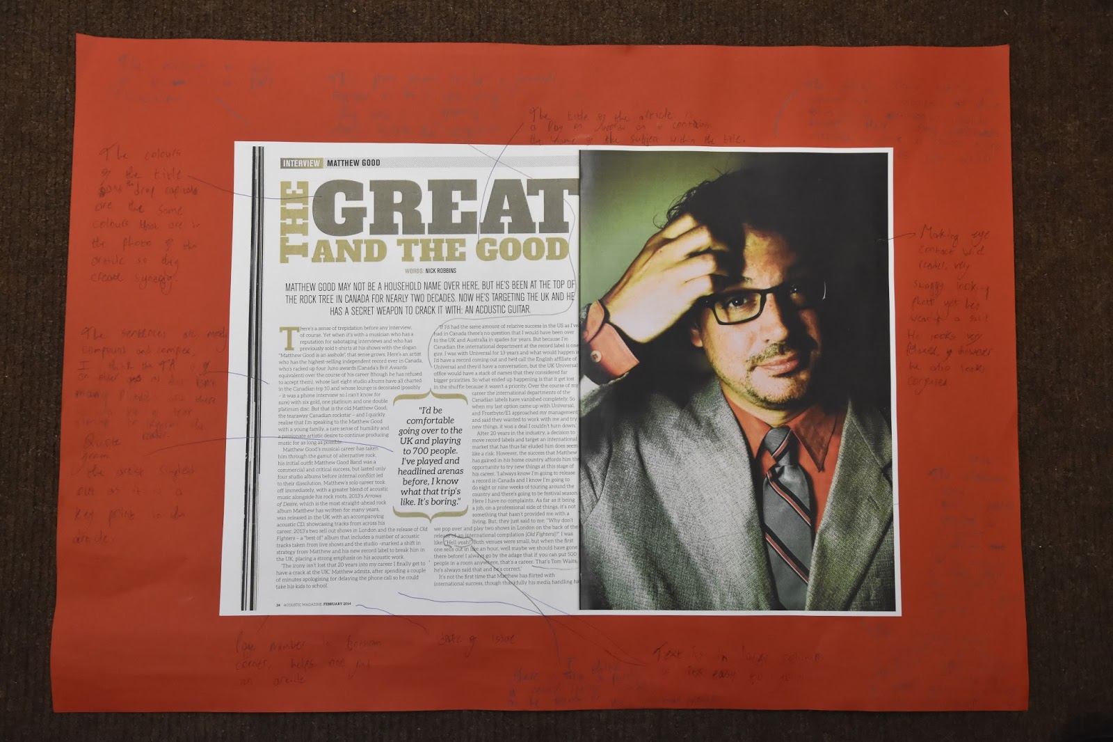
This has influenced my planning and creativity as I like the way the image travels across two pages, I also like the way synergy is created between colours on the image and colours in the text and on the page. I have also used Thinglink which has introduced me to new methods of technology related to media.


Research DPS 1


This has influenced my creativity and planning as I like the fact a picture fills up one whole page and the text is on another whole page, I may choose to use this in my music magazine. On the other hand I do not like the colour scheme used and I do not like the way the title of the article is laid out, therefore I will not use these features for my magazine. I like drop capital and I plan to use this in my magazine as it is a good feature and it also stays in line with the text.

Front Cover Research: Consolidating my research

How this research has influenced my Planning and Creativity


Front cover analysis 1 which was for Q magazine influenced my planning and creativity as I have picked out elements of this front cover and it gives me more of an idea of how I may want to layout my front cover and the type of codes and conventions I may want to use to attain a higher grade. I liked the way the colour of the shirt the subject was wearing creates synergy and links with the text that gives references to other articles on the front cover. 

Front Cover analysis 2 of Kerrang has given me some new ideas, I really like how the background and colour of the masthead work together as they're both the same kind of colour, I do not like how crowded the page is and has given me the idea not to crowd my front cover for my music magazine. 
I also intend to use the style banner on this front cover to advertise a free gift on my front cover.

Front cover 3 influenced my planning and creativity due to the fact the clothes of the subject creates synergy with the background and the colour of some of the text as this seems to be a very black orientated front cover, after seeing this I may want to link the appearance of my cover star to the background and other characteristics of the front cover. I also liked how the text going across the middle of the page linked to the banner and pugs due to them following the same colour scheme. However I didn't like how there was a large piece of text going across the page as I think it takes away from the effect of the pose from the cover star and due to my negative opinion I am obviously not going to use it in my magazine.

Front cover 4 has influenced my planning and research as I like the way there isn't a lot crowding the front cover and I also like how the front cover star's guitar is included in the picture and finally I like how synergy is created from the colour of some of the text linking with the banner on the page. I may choose top use these features in my magazine as I think they're effective.


Contents page research: Consolidating my research

How this has influenced my creativity and planning


Contents page 1 has influenced my planning and creativity as I now have a better idea of how to set out my contents page. I like the fact that many different smaller images have been used on this contents page and also the fact they follow a very similar colour scheme, I think is a very effective and noticeable feature. I have also learned how to use prezi which has introduced me to new technology related to media.

Contents page 2 has influenced my creativity and planning as I like the black and white retro effect used on the image, from the contents pages I've research I have not come across this therefore I may use it as it seems quite unique, I also like all of the contents information is in on single column aligned to the right so there is more room for a large image. I have also used slideshare which is improving my knowledge on technology related to media.

Contents page 3 has influenced my creativity and planning as I like the way the text is wrapped tight around the shape of the images body, I may choose to use this in my magazine as it is very effective aesthetically. I do not like the camera angle used and I will definitely not use this in my magazine and I also think the colour scheme is very boring and it will also not feature in my contents page. I have also used slideshare which is improving my knowledge on technology related to media.

Planning post: Star image

I am going to create a rising star who has quickly broken into the indie music scene and has hit the ground running, they have just released their latest song which has topped the indie music chart, therefore they are the cover story of my magazine as they are a hot prospect. He is a male and he has a very Indie look, he adheres to indie conventions and due to this he is ideal for the indie front cover.

My star is becoming very popular and is being head hunted by many large record companies, he has a very careless attitude and does not care about the criticism people give him for being so young and reckless.

I want to create an image that is stereotypical Indie so people can get a good perception of Indie appearance and an Indie kind of lifestyle. People should instantly be able to tell he is of an Indie genre due to the characteristics I intend to give him.

His prop will be a guitar, whether it is electric or acoustic hasn't been decided yet, I want him have an almost lifeless facial expression, I want him to look like he doesn't care which matches his persona, I also want him to have a pose that makes him look like he doesn't care but also almost as if he is tough and arrogant. I want him to be holding with his guitar showing he is so popular for the reason he is such a good musician, and he wants everyone to know it.

The Indie look is based on messy hair, very dull and lifeless facial expressions, unusual clothing, nothing specific, just clothes that aren't really the common trend, everything here is what I want my star to adhere to. This also supports Richard Dyers theory of representation.

I intend for the location to be in a forest or a wooded area, I think a background including nature makes the front cover a lot more realistic and makes the image come to life, also I would like to break the convention of location of an Indie magazine as Indie front covers usually tend to be studio shots and I want to avoid this.

Contents page research 3


Contents research 3 from RyanFrankish7

This has influenced my creativity and planning as I like the way the text is wrapped tight around the shape of the images body, I may choose to use this in my magazine as it is very effective aesthetically. I do not like the camera angle used and I will definitely not use this in my magazine and I also think the colour scheme is very boring and it will also not feature in my contents page. I have also used slideshare which is improving my knowledge on technology related to media. 

Contents page research 2


Contents page research 2   from RyanFrankish7
I like the black and white retro effect used on the image, from the contents pages I've research I have not come across this therefore I may use it as it seems quite unique, I also like all of the contents information is in on single column aligned to the right so there is more room for a large image. I have also used slideshare which is improving my knowledge on technology related to media.